CrowdFlo is an event management platform.
CrowdFlo is an event management platform that connects ticketing, payments, scanners, credentials, and other event systems in one place. Its integrations help organisers manage event operations more efficiently, reduce manual work, and provide a smoother experience for both staff and attendees.
Role
UI/UX Designer
Duration
1 Weeks
Industry
Event Management - Admin
Why This Event Dashboard Was Needed ?
The existing System Admin had different sections for managing various event operations. However, admin had to move between multiple section to find event related information, which could be time consuming. The new dashboard was created specifically to bring key event information into one quick overview, while keeping the other System Admin section in their existing place. This gave admins a faster way to understand the overall status of an ongoing event without checking each section individually.
Admin Goal
Give admins one clear overview of what’s happening during an ongoing event.
Help admins quickly understand the event status without having to check multiple sections.
Bring key operational information together so everything important is available in one place.
Make the dashboard easy to scan, while keeping the existing System Admin structure and familiar design.
Use the right visual format for each type of information, such as cards for quick stats, charts for trends, and tables for detailed information.
Reduce frustration and extra effort by making important information easier and faster to find.
My Process
01 Gather Requirements
Gathered the information and requirements for the dashboard.
02 Organise the Information
Grouped the information by event operations.
03 Plan the Dashboard
Decided the hierarchy and layout.
04 Design & Prototype
Designed the dashboard UI and created the interactive prototype.
05 Handoff for Implementation
Once the design was approved, I handed it off for development team and the dashboard was implemented
Design Solution
The dashboard brings key event information into one place, using clear hierarchy, visual data, and interactive elements to make information easier for admins to understand and monitor.
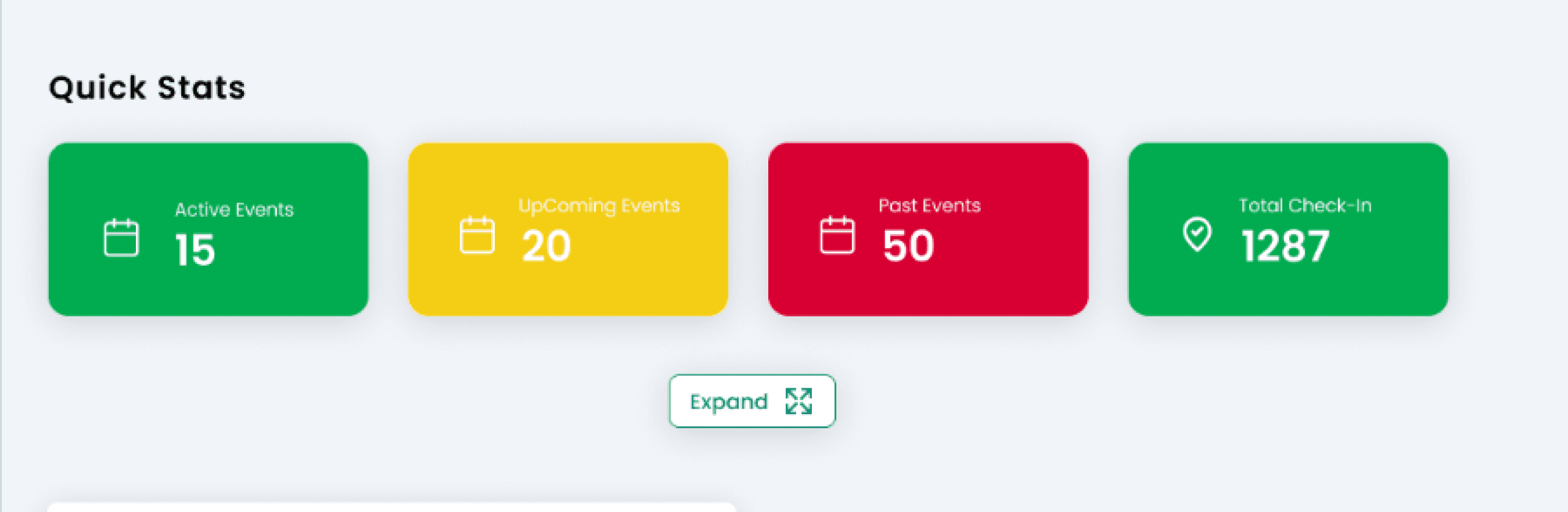
Quick Overview
Gives the admin a quick snapshot of the ongoing event.
Ticketing & Registration
Gives the admin visibility into ticket and registration activity.
Quickly see ticketing and registration numbers.
Understand how many people have registered or purchased tickets.
Monitor ticket-related activity during the event.
Compare current activity through the available visual data.
Allow him review data of different date from changing time range
By selecting specific event admin see data too


Gives the admin an overview of point-of-sale activity.
Monitor sales activity during the event.
Understand transaction-related information from one place.
Identify changes or patterns through the visualised data.
Provides a quick overview of POS activity, helping admins monitor sales and transaction information during the event or any date of event
POS Data
Shows transaction and revenue data through visual graphs.
The graph can be switched between Bar and Line views, allowing admins to view data in different ways.

Access Control
Helps admins monitor access and entry activity.
Gives admins visibility into access activity, making it easier to monitor entries and check-ins across the event.
Attendance Count
Gives admins a quick view of attendee presence and check-in activity.

Final Event Dashboard
In a single view its giving admins a clear overview of the ongoing event.

Conclusion
The dashboard was designed to simplify access to key event information and give admins a clear view of ongoing operations. The final design was handed off and successfully implemented.