FoodLens
Role
UX Research, UI/UX Design
Duration
1 week
Type
Mobile App

Overview
Food labels contain valuable nutritional information, but understanding that information isn't always straightforward. Terms such as saturated fat, sodium, and added sugars can be unfamiliar, especially when people aren't comfortable with the language used on the packaging.I wanted to explore how a mobile experience could help people move beyond simply reading nutrition values to understanding what those values and terms actually mean.
That's where FoodLens began.
FoodLens is a mobile app concept that allows users to scan a packaged food's nutrition label, explore individual nutrients, and access simple explanations in a language they understand comfortably.
My focus was to design an experience that makes nutrition terminology easier to understand without overwhelming users with information.
The problem
Nutrition labels contain important information, but terms like saturated fat, sodium, and added sugars can be difficult to understand. People may read the label without fully understanding what the information means.
Nutrition labels are designed to inform, but the amount of information and technical language can make them difficult to interpret. For everyday consumers, understanding what's healthy, what to avoid and what each nutrient means can become a confusing experience.

Why Did I Do This?
I wanted to explore how design could make everyday nutrition information easier to understand. Food labels provide valuable details, but unfamiliar terminology can make it difficult for people to understand what they are reading.
This personal project gave me an opportunity to explore a real-world usability problem, apply my UI/UX design process beyond visual design, and create an experience that makes nutrition information more accessible through simple explanations and language preferences.
Design Challange
How might we simplify complex food label information into an experience that is easy to understand, accessible and useful in everyday life?
My Design Approach
01
Discover
STAGE 01
Understand the problem and user needs.
02
Define
STAGE 02
Identify the key challenge and design goal.
03
Ideate
STAGE 03
Explore solutions and map the user flow.
04
Design
STAGE 04
Create wireframes and UI screens.
05
Prototype
STAGE 05
Connect screens into an interactive experience.
06
Test & Refine
DELIVER
Observe usability and improve the design.
Empathy Map
The empathy map captures the user's thoughts, feelings, and behaviors around understanding nutrition labels, helping identify opportunities to make nutrition information simpler and more accessible.
I created this map based on informal conversations with people who read nutrition labels but sometimes struggle to understand technical terms. By organizing their perspectives into Says, Thinks, Does, and Feels, I identified opportunities to make FoodLens more intuitive and easier to understand.
"Placeholder images are used to protect participant privacy, as the personas are based on informal conversations rather than formal research profiles."
User 1
SAYS
Says
“I don't understand what these nutrition terms mean.”
“I wish these terms were explained in simple words.”
THINKS
Thinks
What does this term actually mean?
Why is this nutrient mentioned on the label?
Where can I find an explanation I can understand?
DOES
Does
Reads nutrition labels on packaged food.
Looks up unfamiliar nutrition terms online.
Tries to understand explanations from different sources.
FEELS
Feels
Confused by technical terminology.
Frustrated when explanations are complicated.
Curious to learn more about nutrition.

User 2
SAYS
Says
“I want to understand what these nutrition terms mean for my child.”
“I find it difficult to understand these labels in English.”
THINKS
Thinks
What do these unfamiliar terms mean?
Can I understand this information in my preferred language?
How can I learn what these nutrients are and why they matter?
DOES
QUADRANT 03
Does
Checks packaged-food labels when shopping for her child.
Tries to translate unfamiliar nutrition terms.
Seeks simpler explanations to understand the information.
FEELS
Feels
Concerned about understanding her child's food.
Frustrated by language barriers.
More confident when information is explained clearly.

Key Priority
01
Make Nutrition Easy to Understand
Explain unfamiliar nutrient terms in simple, everyday
language.
02
Keep the Experience Simple
Help users move from scanning a label to understanding a
nutrient with minimal effort.
03
Support Language Preferences
Let users choose a familiar language for nutrient
explanations.
04
Show Details When Needed
Present nutrition information clearly and let users explore
individual nutrients without overwhelming them.
Information Artchitecture

Brainstorming & Exploring wifreframe with help of AI tool


Visual Design

High-Fidelity Wireframe




Usability Testing
I tested the FoodLens prototype with 4 participants to see how easily they could move through the main features, from scanning a food label to understanding nutrients and choosing their preferred language.
Tasks Tested
Find the scan feature and navigate to the nutrition details.
Open and understand a nutrient explanation.
Find and select a preferred language.
Key Finding
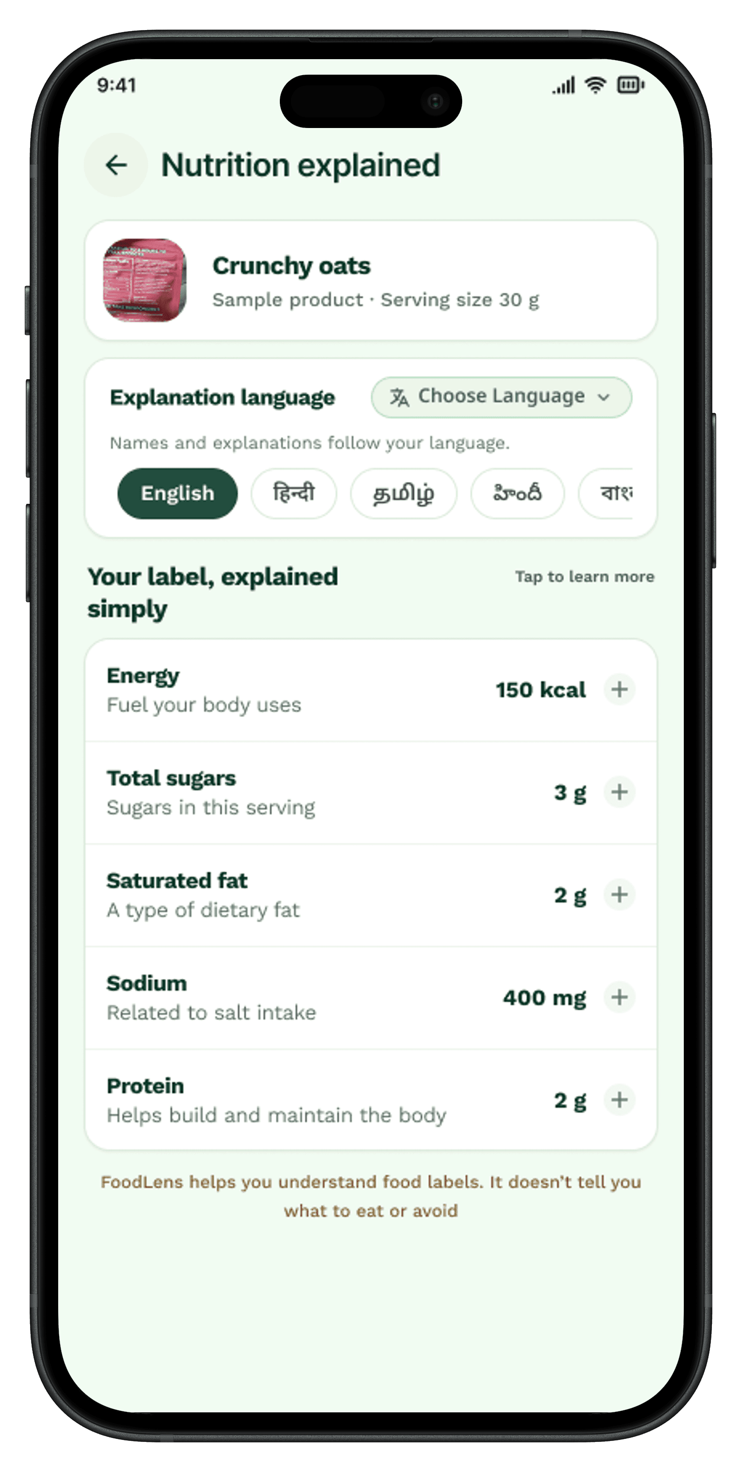
In the initial design, five language options were displayed as horizontally scrollable chips. I noticed that as more languages are added, users may need to scroll several times to find the one they want.
Design Improvement
To make language selection easier, I added a “Choose Language” search option above the language chips. This gives users a more direct way to find their preferred language without relying only on scrolling.
Outcome
This improvement makes language selection more convenient and allows the design to accommodate more languages as FoodLens grows. Further usability testing will help confirm whether the new search option makes the experience easier for users.